
Auto model and variables quality

kypexin
New Altair Community Member
Hi there,
What is the logic behind assigning yellow / green status to variables in Auto Model?
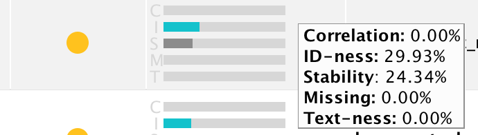
I just came across the situation where variables with higher stability and ID-ness are considered green, while those with lower stability / ID-ness are yellow. I would expect it to be the other way around.


What is the logic behind assigning yellow / green status to variables in Auto Model?
I just came across the situation where variables with higher stability and ID-ness are considered green, while those with lower stability / ID-ness are yellow. I would expect it to be the other way around.
Tagged:
0
Best Answer
-
Hi,The first two cases are yellow because of a close-to-zero correlation with the label. The full logic is actually described in the help text of Auto Model. Here are the key points (from 9.2 Beta):
Status
The colored status bubble provides a quality indicator for a data column.
-
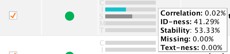
Red: A red bubble indicates a column
of poor quality, which in most cases you should remove from the data
set. Red can indicate one of the following problems:
- More than 70% of all values in this column are missing,
- The column is practically an ID with (almost) as many different values as you have rows in your data set but does not look like a text column at the same time (see below),
- The column is practically constant, with more than 90% of all values being the same (stable), or
- The column has a correlation of lower than 0.0001% or higher than 95% with the label to predict (if a label is existing).
-
Yellow: A yellow bubble indicates a
column which behaves like an ID but also looks like a text or which
has either a very low or a very high correlation with the target
column. They correlation-based yellow bubbles can only appear if the
task is "Predict".
- ID which looks like text: this column has a high ID-ness and would be marked as red but at the same time has a text-ness of more than 85%.
- Low Correlation: a correlation of less than 0.01% indicates that this column is not likely to contribute to the predictions. While keeping such a column is not problematic, removing it may speed up the model building.
- High Correlation: a correlation of more than 40% may be an indicator for information you don't have at prediction time. In that case, you should remove this column. Sometimes, however, the prediction problem is simple, and you will get a better model when the column is included. Only you can decide.
I think the only missing number is the ID-ness threshold for becoming red. This threshold actually depends on the type of the column and is 0.7 for nominal columns and 0.99 for integer columns.Hope this helps,Ingo2 -
Red: A red bubble indicates a column
of poor quality, which in most cases you should remove from the data
set. Red can indicate one of the following problems:

Answers
-
Hi,The first two cases are yellow because of a close-to-zero correlation with the label. The full logic is actually described in the help text of Auto Model. Here are the key points (from 9.2 Beta):
Status
The colored status bubble provides a quality indicator for a data column.
-
Red: A red bubble indicates a column
of poor quality, which in most cases you should remove from the data
set. Red can indicate one of the following problems:
- More than 70% of all values in this column are missing,
- The column is practically an ID with (almost) as many different values as you have rows in your data set but does not look like a text column at the same time (see below),
- The column is practically constant, with more than 90% of all values being the same (stable), or
- The column has a correlation of lower than 0.0001% or higher than 95% with the label to predict (if a label is existing).
-
Yellow: A yellow bubble indicates a
column which behaves like an ID but also looks like a text or which
has either a very low or a very high correlation with the target
column. They correlation-based yellow bubbles can only appear if the
task is "Predict".
- ID which looks like text: this column has a high ID-ness and would be marked as red but at the same time has a text-ness of more than 85%.
- Low Correlation: a correlation of less than 0.01% indicates that this column is not likely to contribute to the predictions. While keeping such a column is not problematic, removing it may speed up the model building.
- High Correlation: a correlation of more than 40% may be an indicator for information you don't have at prediction time. In that case, you should remove this column. Sometimes, however, the prediction problem is simple, and you will get a better model when the column is included. Only you can decide.
I think the only missing number is the ID-ness threshold for becoming red. This threshold actually depends on the type of the column and is 0.7 for nominal columns and 0.99 for integer columns.Hope this helps,Ingo2 -
Red: A red bubble indicates a column
of poor quality, which in most cases you should remove from the data
set. Red can indicate one of the following problems:
-
Thanks @IngoRM, taking correlation into account makes sense here. However, isn't 0,01% threshold way too low? I mean, if we compare 0,01% correlation (falls into yellow status) and 0,03% which falls into green status -- isn't that difference too subtle to count on?0
-
@kypexin @IngoRM, I think this is a good consideration. I noticed a similar "why this color" as I considered some columns as to be important prior to any modeling. I propose to use some standard datasets with the knowledge of domain expertise to demonstrate the impact of following the full logic for all datasets. In other words it would be nice to find examples where some pitfalls could be illustrated.
It is a question that comes from the audience when the steps of automodel are demonstrated.
Cheers
Sven
0 -
Hi folks,Sure, if you have more data sets to show what works and what does not, we would love to improve the thresholds.> However, isn't 0,01% threshold way too low? I mean, if we compare 0,01% correlation (falls into yellow status) and 0,03% which falls into green status -- isn't that difference too subtle to count on?To be honest, both are unlikely to be great predictors and the users can always override this. Also keep in mind that yellow is still turned on by default. It is really more a warning sign / hint to look into this while for the green ones there is not much too worry about and keeping them in and letting the ML method deal with it is generally better.> It is a question that comes from the audience when the steps of automodel are demonstrated.Makes sense. I would turn it around though and make the point that it is a strength of this approach that we make a recommendation here and keep the user in the loop to make the decision.Also I want to make clear that I am not arguing here. I just wanted to make the point that the traffic lights are a guidance, not more. Users should always think about those suggestions and take their domain knowledge into account to make the final call. This is actually why I like this overview table so much. Out of hundred columns I can quickly focus on the most important ones where human intervention is most justified.But again, if you guys have data sets where those recommendations utterly fail, please let us know or share them if possible. Of course we try to use thresholds which work well for the vast majority of data sets (and we have looked into the values for a couple dozen of data sets already), but the more data sets we consider the better.Cheers,Ingo2
-
Dear RM friends,
Constructive and realistic feedback. Balancing between Automodel and #noblackboxes is essential and "the traffic lights are a guidance" is the answer.
Cheers
Sven2
