How to interpret K-nn global anomaly score graph for different k?
hi,
to detect outliers in my dataset, I was using the k-nn global anomaly score operator, unfortunately, it does not give any hints how to choose k,
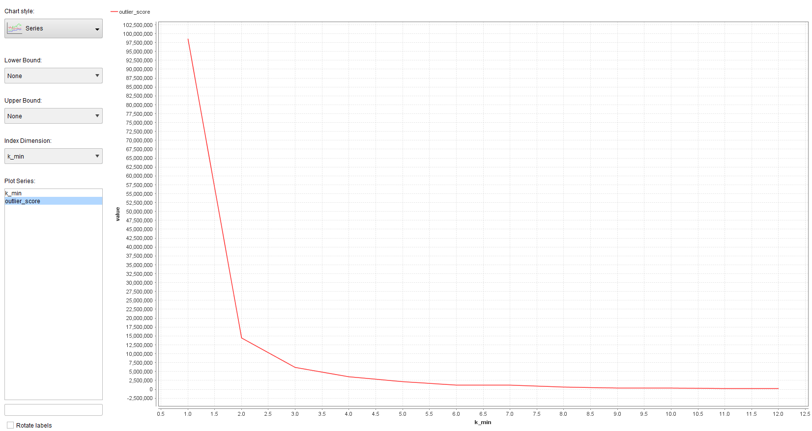
so I put the operator inside a grid optimization to search for different k, and convert the outlier score to a performance vector and log it (screenshot)
 so
so
so I think the algorithm for k-nn GAS works as follows: Either choose the k-th nearest neighbor as distance only or choose the average to the k nearest neighbours.
As I increase k, the outlier score also grows, naturally... I get this graph for different k:

my question is, is there any way to interpret maybe the slope of the graph or something else? How could I interpret this, e.g. the high increase of the slop at
k=1 and equally k = 10? does that have any significance ? should I therefore choose k = 1 or k=10 as the best k?
I get this graph with the Cluster based Local Outlier Factor (CBLOF) with k-means:

I know that with k= 1 its kind of "overfitting", as variance is very high and bias is very low, so does this tell me anything about outliers, or should I go for safety and choose higher k? like k= 2 or k=3 ?

 Unicorn
Answers
First and foremost, remember that the output of any algorithm based on k-nn is highly sensitive to distance metrics. Thus, normalization is highly advisable because all attributes might not natively be in the same scale or even order of magnitude. I'd suggest the Z-transform as the best normalization approach to any attributes that you are using in your distance comparisons.
Since the k-nn global anomaly score is simply the average distance measure, of course it is going to increase as k increases. However, looking at the scale of this score in your data, it looks like you have not normalized the data first, which means I would be very careful in interpeting these results until you do that. The "bump" in the slope that you observed seems like it tells you that after k=1, the average distance is much higher, which makes sense in a lot of datasets. The second bump may be an indicator of a change in observation density when k>10. But again, you may see something quite different after normalization.
The LOF approach is different, using a density-based approach to defining outliers rather than a distance-based approach. Many times it will regard a given point as an outlier that when using the pure distance measures it would not have seemed unusual. It might be more suitable to your dataset but it is difficult to say objectively which is better without more information. Like the first graph, it is not surprising that at k=1 there is a very different measure than when k>1 because when k=1 the neighborhood measure is the same as the individual measure so there is not much of a density comparison occurring. But once again, the scale here suggests that your data is in need of normalization before these metrics would be meaningful.
Lindon Ventures
Data Science Consulting from Certified RapidMiner Experts
I normalized my dataset and used k-NN again:
is this graph of any use?