The Altair Community is migrating to a new platform to provide a better experience for you. In preparation for the migration, the Altair Community is on read-only mode from October 28 - November 6, 2024. Technical support via cases will continue to work as is. For any urgent requests from Students/Faculty members, please submit the form linked here
"Quantile visualization has odd axes"

Hi again!
Work has gone on apace, thanks to Ingo
I'm now trying to visualize my results. A good box plot, aka quantile in RapidMiner, chart, would be great.
However, RapidMiner is making odd axes:
The numbers along the y-axis have been turned into scientific notation, but they're real numbers in the range of 0-200 or so. There doesn't seem to be an option to edit the y-axis. How can I undo this scientific notation conversion, and just show the actual numbers on the y-axis?
Thanks!
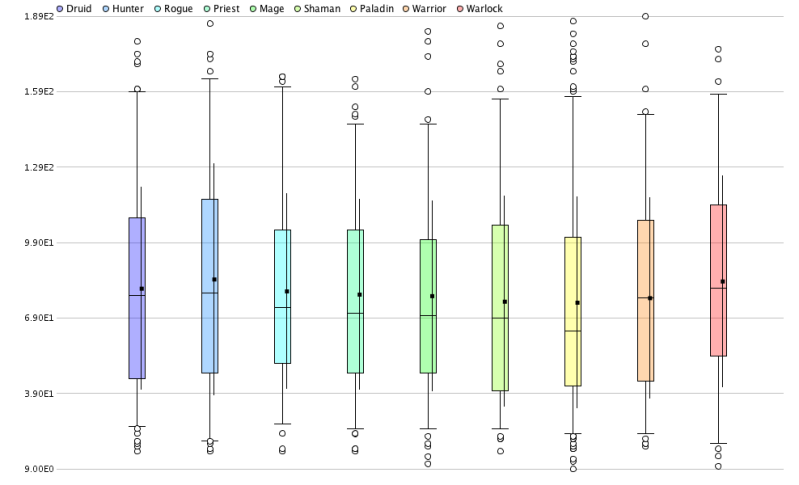
Tagged:
0
Answers
Cheers,
Simon